Apartment Unit Paint Color: Top 5 Stunning Choices
Why Apartment Unit Paint Color Matters More Than Ever
In today’s competitive rental market, apartment unit paint color choices are critical for property success. Here are the top considerations for choosing the right colors:
Best Paint Colors for Apartments:
- Neutral favorites: Greige, warm gray, soft white, beige
- Trending colors: Sage green, dusty blue, earthy ochre
- Room-specific: Light colors for small spaces, calming blues for bedrooms
- Avoid: Bright yellows, vibrant oranges, dark browns (too polarizing)
Key Benefits:
- Make small spaces appear 20-30% larger with light colors
- Attract 40% of U.S. renters (Millennials) with neutral palettes
- Reduce vacancy time in a market with just 5.8% vacancy rates
With nationwide apartment rents averaging over $2,000 per month and rental rates up 31% over the last decade, property managers can’t afford to overlook the power of paint. The right colors create a first impression that turns showings into lease signings.
Color psychology is key to how potential tenants feel about a space. Post-pandemic trends emphasize cleanliness and calm—whites symbolize purity, while dusty blues create the comforting vibe many renters crave today.
As Moe Shariff, owner of Apartment Services Group, I’ve seen how the right apartment unit paint color choices reduce vacancy and command higher rents in Houston. My experience shows that strategic paint decisions maximize both appeal and return on investment.

The Power of Paint: How Color Transforms Apartment Spaces
Paint does more than make walls pretty; it transforms how a space feels and functions. As a Houston apartment renovator, I can confirm a fresh coat of paint is the most budget-friendly way to make a dramatic impact. Dark walls can make an apartment feel like a cave, but the right light apartment unit paint color makes the same space feel open, bright, and welcoming.
The pandemic shifted preferences toward clean, calm, and comforting homes. This brought warm, inviting whites back into the spotlight, along with dusty and soft sky blues that create a peaceful vibe. Colors affect our perception, making small rooms look larger and dark spaces feel brighter. Choosing the right paint color isn’t just about aesthetics; it’s about creating an experience that makes renters feel at home.
How to Select an Apartment Unit Paint Color to Create Mood
The right paint color helps a room fulfill its purpose. Understanding color psychology makes choosing the perfect apartment unit paint color easier.
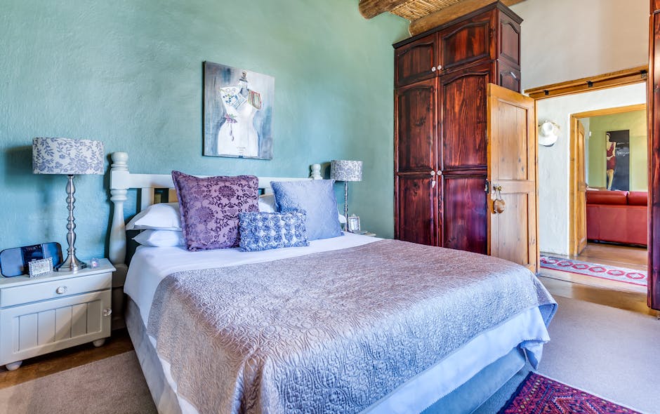
Blues for tranquility. Blue rooms promote relaxation. Light blues are ideal for bedrooms, creating a serene escape. Popular dusty blues are calming without feeling cold.
Greens for balance. Green walls bring a touch of nature indoors. Popular sage green is soothing and works well in living rooms to create a centered, comfortable feel.
Earth tones for grounding. Warm beige, soft taupe, and gentle browns create security and comfort. These welcoming colors are excellent for common areas.
Warm whites for cozy brightness. Not all whites are the same. Avoid stark, clinical white. Creamy, warm whites feel like home, brightening spaces while adding an inviting feel.

Making Small Apartments Feel Bigger and Brighter
Paint is a secret weapon against cramped quarters. The right paint choices can make a tiny apartment feel spacious.
Light colors are key for small spaces. They reflect light, making rooms feel open and airy, which is crucial in apartments with little natural light. Cool colors like soft grays, pale blues, and gentle greens can also make walls seem to recede, creating an illusion of more space.
Paint the ceiling. Painting the ceiling the same color as the walls, or a lighter shade, can make rooms feel taller and more spacious. It’s a simple but effective trick.
Use monochromatic schemes. Using similar tones throughout a small space creates a seamless flow, making it feel larger. Soft pastels work well, adding color without overwhelming the room.
Choose off-whites over stark white. Off-whites provide the space-expanding benefits of white but with added warmth and character. Pearl gray is another modern, sophisticated option that keeps rooms light.
For more comprehensive ways to transform your space, check out our ultimate guide to apartment renovation and interior design. Sometimes a fresh paint job is just the beginning of what’s possible.
Choosing the Best Apartment Unit Paint Color for Maximum Appeal
Picking the perfect apartment unit paint color is about making a great first impression. The key is to find colors that are fresh and current but won’t look dated quickly. Recent design trends have shifted toward colors that evoke comfort and calm, making spaces feel safe and serene.
Today’s most appealing colors blend familiarity with sophistication. Greige (a mix of gray and beige) and dusty blues are prime examples of neutrals with personality. The Sherwin-Williams’ ColorMix Forecast 2023 for multi-family properties highlights bold grays, muted greens, and earthy browns. These colors are grounded and natural yet stylish.
Timeless Neutral Apartment Unit Paint Color Choices
Neutrals are the timeless choice for rentals, but not all neutrals are the same.
Greige is a superstar for a reason, blending gray’s sophistication with beige’s warmth. A greige like Oyster White offers character without being overwhelming, far superior to sterile white.
Warm grays are popular, offering a welcoming, contemporary vibe. Their subtle undertones prevent the coldness of some other grays.
Soft whites are better than stark whites. Bright white can feel clinical, while creamy off-whites add warmth and coziness that tenants appreciate.
Classic beige and taupe are reliable choices. These earth tones create an inviting atmosphere that complements nearly any furniture style.
Popular Color Combinations by Room
While neutrals work everywhere, strategic color choices can define rooms and add character.

Living rooms: Use colors that encourage relaxation. A light gray or greige base pairs well with blue or green accents. For a dramatic look, try Pure White with Charcoal Blue and Austere Gray. For an earthy feel, combine Moderate White, Dover White, Macadamia, and Wool Skein.
Bedrooms: Create a tranquil retreat with calming blues (like Benjamin Moore’s Celestial), gentle greens (like Celadon 590), or soft lavenders. The combination of Drizzle with Downy is also very soothing.
Bathrooms: Use fresh, clean colors for a spa-like feel. Light blues, greens, and warm whites are great choices. For drama, consider Black Magic with Garden Spot and Double Latte, or grays like Rhinestone and Gray Clouds with a pop of Cajun Red.
Kitchens: This is a place to have fun with color. While white is standard, other colors can make a unit stand out.
- Black: Sophisticated and classic.
- Gray: Modern without being too dark.
- Taupe: An expensive coffee shop vibe.
- Cream: Vintage yet fresh.
- Blue: Calming and invigorating (Sky Blue is great for low-light kitchens).
- Orange/Yellow: Bright and sunny, but use with care (e.g., Cayenne with Wool Skein in well-lit spaces).
For more kitchen inspiration, check out our apartment kitchen renovation services.
Paint Colors to Avoid in Rental Properties
Bright yellows, vibrant reds, loud oranges, and deep browns are polarizing. While they express personality, it’s a specific taste that may not appeal to all potential tenants. The goal in rentals is to choose colors that allow tenants to envision themselves in the space, rather than being distracted by a style that isn’t their own.
Practically, highly saturated colors are harder to cover up when repainting, requiring more primer, paint, time, and money. Easy-to-refresh colors are a better long-term choice.
The goal is not to be bland, but to choose welcoming apartment unit paint colors that appeal to a wide audience. This creates a neutral canvas for tenants to personalize with their own décor.
Advanced Color Strategies for a High-End Look
Paint can be a secret weapon for creating a professionally designed look. Advanced techniques can lift an apartment from good to “wow,” impressing prospective tenants. Effortlessly sophisticated spaces often use proven design principles. The good news is these strategies are simple and work even on a modest budget.
, secondary navy blue sofa and rug (30%), and accent yellow throw pillows and decor (10%). - apartment unit paint color")
Applying the 60:30:10 Color Rule
The 60:30:10 rule is a foolproof formula for creating balanced, harmonious spaces. It can transform a bland apartment unit into a brilliant one.
- 60% Dominant Color: This is typically the wall color and sets the room’s mood. For rentals, this is usually a neutral like warm gray, greige, or soft white.
- 30% Secondary Color: This color appears in furniture, rugs, or curtains. It adds personality while maintaining broad appeal, like a navy sofa or wood furniture.
- 10% Accent Color: Used for small items like pillows, art, or a painted door, this color adds a memorable pop of personality.
This rule creates natural visual balance, preventing a space from being overwhelming or boring. It gives prospective tenants that “just right” feeling.
Using Accent Walls and Color Zoning Effectively
Strategic apartment unit paint color application, like accent walls and color zoning, can make spaces, even studios, feel larger and more functional.
Create a focal point with an accent wall. Painting one wall a richer hue, especially behind a bed or sofa, draws the eye and adds character. Choose a wall that naturally draws attention, like one with a fireplace or built-ins. In a plain room, painting the wall opposite the entrance creates immediate drama.
Color zoning defines open-concept spaces without walls. By using different paint colors, you can visually separate areas like the kitchen and living room, which is ideal for small apartments. This technique is also perfect for creating work-from-home zones. An accent wall behind a desk can define a dedicated office nook. Use a color that promotes focus, like a calming blue-gray.
Highlight architectural features with paint. Painting trim, ceiling details, or interior doors in a complementary or accent color adds a sophisticated touch that makes units stand out.
These advanced strategies help create that “wow factor” that turns apartment showings into signed leases. For more inspiration on changing your properties, explore our guide to stunning apartment renovation ideas that are trending in 2025.
Painting for Your Target Demographic: Generational Preferences
An often-overlooked aspect of choosing an apartment unit paint color is your target demographic. Each generation has different design preferences. The rental market is diverse: Millennials make up 40% of U.S. renters, and Gen Z is a growing force. Understanding what appeals to each group can mean the difference between a vacant unit and multiple applications.
| Generation (Birth Years) | General Approach | Preferred Colors | Avoid | Psychological Benefits |
|---|---|---|---|---|
| Gen Z (1997-2012) | Expressive, Bold | Yellow, Purple, Orange, Pink; Muted Earth Tones | N/A | Positivity, Creativity, Intuition |
| Millennials (1981-1996) | Neutral, Eclectic | Soft Grays, Creams, Pale Neutrals; Mint Green, Icy Blue, Earthy Brown, Orange, Red accents | Anything reflecting previous generations | Comfort, Calm, Understated Vibes |
| Gen X (1965-1980) | Bright, Global | Turquoise, Jade Green, Deep Violet, Indigo, Dramatic Red, Deep Pink; Paired with Gray/Silver, Pale Mushroom, Earthy Neutrals | N/A | Vibrancy, Energy |
| Baby Boomers (1946-1964) | Soothing, Restorative | Blues (Superior Blue S490-7), Warm Whites, Yellows, Deep Browns (Sturdy Brown MQ2-48) | N/A | Tranquility, Restoration, Rejuvenation |
| Silent Generation (1927-1945) | Practical, Cheerful, Relaxing | Clear Mid-Tone Blues, Jade Green, Browns; Refreshing Pastel Yellows, Pinks; Soft, Welcoming Whites | Murky Yellows, Browns, Greens | Cheerfulness, Relaxation, Elegance |
Millennials and Gen Z: Neutrals Meet Bold Expression
Younger generations want authentic, Instagram-worthy spaces, and their color preferences reflect this.
Millennials gravitate toward soft grays, creams, and pale neutrals for an apartment unit paint color. They prefer an understated, sophisticated vibe. Light grays with subtle undertones, paired with mid-tone browns or black accents, create an “effortless elegance” that feels curated but not over-designed.
Gen Z renters are drawn to expressive colors like yellows, purples, oranges, and pinks, which symbolize positivity and creativity. This doesn’t mean painting entire units bright yellow. Instead, use these colors as accents. Muted earth tones and neutral bases like Statement White paired with a subtle accent color (like Voyage PPU13-07) are great rental-friendly options for this demographic.
The social media influence is huge. A photogenic color palette can lead to organic marketing when tenants share photos of their apartment online.
Gen X and Baby Boomers: Global Hues and Tranquil Retreats
Don’t forget Gen X and Baby Boomers, who have significant purchasing power and often make great long-term tenants.
Gen X renters appreciate “global sophistication.” They are drawn to jade greens, deep violets, and dramatic reds, paired with sophisticated neutrals like gray or silver. A Gen X-friendly palette might combine a cool white like Whipped Cream with a bold accent like Vine Leaf or Midnight Blue for a refined look.
Baby Boomers want their homes to be tranquil retreats. They are drawn to blues, warm whites, gentle yellows, and rich browns that promote comfort and restoration. Colors like Superior Blue paired with warm whites and deep browns (like Sturdy Brown) create the peaceful atmosphere they crave. These are timeless choices that promote well-being.
For the Silent Generation, use clear mid-tone blues, jade greens, and refreshing pastels. Avoid murky tones; they prefer fresh, welcoming colors that offer casual elegance.
The beauty of understanding these generational preferences is that you can make strategic apartment unit paint color decisions that resonate with your target market, creating spaces that feel like home from the moment prospective tenants walk through the door.
Frequently Asked Questions about Apartment Paint
When it comes to apartment unit paint color decisions, property managers and landlords often have similar questions. Here are the answers I give most frequently based on my years of experience renovating apartment units in Houston.
What is the most popular paint finish for apartment units?
Eggshell and satin finishes are the best choices for rental properties for several reasons:
Eggshell finish is ideal for living rooms and bedrooms. It’s durable and easy to clean but has a low sheen that doesn’t highlight imperfections, creating a warm feel.
Satin finish is tougher and more moisture-resistant, making it perfect for high-traffic areas like kitchens, bathrooms, and hallways. Its slight shine also brightens spaces.
Avoid flat or matte finishes in rentals. They scuff easily and are difficult to clean, often requiring a full repaint instead of a simple wipe-down.
How do I choose a paint color that works with existing flooring and cabinets?
Start with the undertones of fixed elements like flooring and cabinets.
For warm-toned elements like honey oak cabinets or warm wood flooring, choose paint colors with warm undertones like beige, warm whites, or greiges with yellow or red bases.
For cool-toned elements like gray laminate flooring or white cabinets with blue undertones, stick with cool paint colors like gray, cool whites, or soft blues.
Always test paint swatches directly next to your fixed elements at different times of day. Light changes how colors appear, and this simple step prevents costly mistakes. The key is creating harmony, not necessarily matching everything perfectly.
What are the best exterior paint colors for an apartment building?
Exterior apartment unit paint color choices must be durable, have broad appeal, and age gracefully. Based on my Houston experience, timeless neutrals are your safest bet.
Gray, beige, and off-white offer the broadest appeal and won’t look dated in five years. They also photograph well for listings.
Lighter colors are particularly smart for smaller buildings because they make the structure appear larger and more inviting.
Darker accent colors like navy or charcoal work beautifully for trim, doors, or architectural details. They add sophistication and depth without overwhelming the building.
Remember to consider your surrounding environment. The goal is harmony with the neighborhood while still making your building stand out for the right reasons.
Conclusion
Choosing the right apartment unit paint color is a smart business decision. As we’ve seen, the right palette can transform spaces, influence emotions, and appeal to your target demographic.
In a competitive market with low vacancy and high rents, every advantage counts. The right paint choices can reduce your vacancy time significantly while commanding higher rents from tenants who appreciate good design.
We’ve explored how light colors can make small apartments feel 20-30% larger, why neutrals like greige dominate, and how to use advanced strategies like the 60:30:10 color rule. Paint is your secret weapon for property success.
Paint stands out as the most cost-effective upgrade you can make to boost property value. It delivers immediate visual impact, helping a potential tenant feel at home.
The strategic use of accent walls, color zoning, and demographic-targeted palettes we’ve discussed can lift your properties from basic rentals to desirable homes. Whether you’re appealing to Millennials who crave Instagram-worthy neutrals or Gen Z renters who appreciate subtle pops of personality, the right colors create that crucial emotional connection.
For professional results that maximize your investment return, trust the expertise that comes from years of Houston apartment renovations. At Apartment Services Group, we understand that every paint decision impacts your bottom line. Our team brings the knowledge and attention to detail that transforms ordinary units into spaces tenants are excited to call home.
Ready to see how the right apartment unit paint color strategy can transform your property’s appeal and profitability? Let us help you transform your property with expert apartment renovations that attract quality tenants and reduce vacancy times.
Your next successful lease signing might just be one paint color away.